Visualizations
Visualizing a Specific Prediction
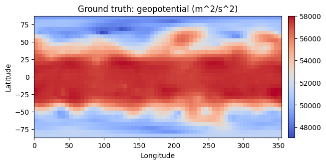
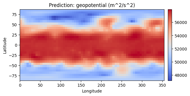
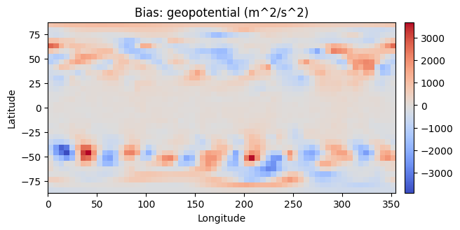
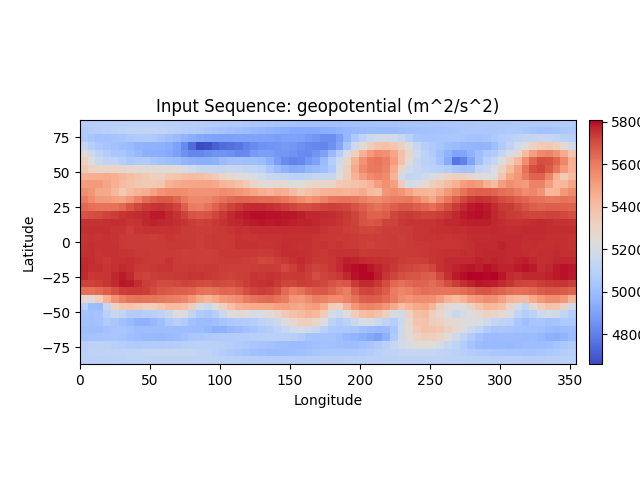
For a specific prediction, ClimateLearn can show the bias, defined as the predicted value minus the observed value at each grid cell. This is useful for intuitively understanding which direction the model is erring in.
import climate_learn as cl

# assuming we are forecasting geopotential from ERA5
dm = cl.IterDataModule(...)
model = cl.load_forecasting_module(...)
denorm = model.test_target_transforms[0]

cl.utils.visualize(
    model,
    dm,
    in_transform=denorm,
    out_transform=denorm,
    variable="geopotential",
    src="era5",
    index=0  # visualize the first sample of the test set
)
In the case that history is greater than 1 (i.e., the model is given a
sequence of historical weather states as input), cl.utils.visualize
returns an object which can be animated. See the
quickstart notebook
for an interactive example of this.
from IPython.display import HTML
in_graphic = cl.utils.visualize(...)
HTML(in_graphic.to_jshtml())
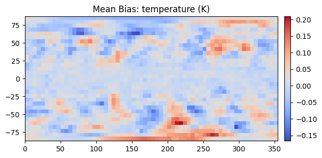
Visualizing Average Performance
ClimateLearn can also display the mean bias, which is the average bias across the entire testing set. This is helpful for understanding trends in the model’s predictions.
import climate_learn as cl

# assuming we are forecasting geopotential from ERA5
dm = cl.IterDataModule(...)
model = cl.load_forecasting_module(...)
denorm = model.test_target_transforms[0]

cl.utils.visualize_mean_bias(
    dm,
    model,
    out_transform=denorm,
    variable="geopotential",
    src="era5"
)